Over the weekend I came across one of those many internet tropes – a quote from someone, on a pretty background, with no interpretive comment by the poster. I must admit that normally I ignore these and scroll past them to a post which has more engagement with a real person. But this one did actually catch my eye, mainly because it resonated with what I was already thinking about.
Here’s the quote (without the pretty background)
“Science fiction deals with improbable possibilities, fantasy with plausible impossibilities” (Miriam Allen deFord)
Cover image – Xenogenesis (Goodreads)
Of course I started worrying at this, like a lively dog chewing at a toy. Leaving aside the rather pleasing symmetry of words, did I actually agree with it? The lady to whom the quote is attributed was an American writer whose main activity was in the mid-twentieth century. She was roughly contemporary with EE (Doc) Smith, a generation down from HG Wells, and rather older than Isaac Asimov. Most of her writing was in the form of short stories for magazines, though she wrote a few novels as well. She straddled the genres of mystery writing, true crime accounts, and science fiction – for the curious who don’t want to shell out real money, several of her works are on the Project Gutenberg site.
Isaac Asimov (Wikipedia)
So, did I end up agreeing with the sentiment? Well, not really. Miriam Allen deFord was writing in a time when genres were quite strictly defined, especially by those individuals who ran the magazines of the day. Those people were hugely influential within their sphere, and were instrumental in founding the writing careers of a lot of people. But their personal likes and dislikes shaped what was written. Allegedly, Isaac Asimov almost never wrote about alien life because John Campbell, editor at Astounding Science Fiction (later called Analog), had a personal antipathy to that kind of storyline. In Asimov’s case, the habit was so strong that, so far as I can recall, aliens appear just twice in his writing – in a parallel universe in The Gods Themselves, and in an enormously far ahead future in The End of Infinity.
Cover – The Buried Giant (Goodreads)
We live today in a different world. Genres do not create such important divisions. This is most true in the indie world, but successful authors in the trad world also experiment with crossing genre boundaries. For example, Kazuo Ishiguro has explored several non-standard plotlines and combinations. But many indie authors positively revel in creating books which don’t fit traditional pigeonholes.
Nowadays, science fiction and fantasy are often bundled together under the joint heading “speculative fiction”, with less perceived importance on whether the particular book fits one side or the other of some imaginary line. To be sure, there is still a spectrum of actual content, from “hard” science fiction in which the science bit seeks to be as credible as possible, through to fantasy which does not even seek a rational justification for actions or attributes. Most of my science fiction writing leans towards the geeky end of that spectrum, with Half Sick of Shadows a striking exception. Anyway, within that spectrum there are enormous areas of mixed colour – plot elements for which either a scientific or fantasy explanation might be found, and about which perhaps different characters in the book might hold different opinions. I think that’s fine, and a sign that the whole field has matured from a kind of binary opposition.
So, picking up the story where l left off two weeks ago, it’s time today to look at science fiction set in the near future from its author. Last time the focus was mainly on stories set hundreds of years in the future, where the problem is often that the technology seems pitched at too low a level. But there are different pitfalls with telling a tale in the next couple of generations. Here, an author may well assume that all kinds of things will happen quickly, when in fact they take much longer.
Flying car from Bladerunner (PInterest)
Flying cars are a stock image for a lot of stories, including Back to the Future and Bladerunner. Now, cars have changed in lots of ways over the span of my lifetime, but they don’t fly (and we still don’t have hoverboards). Yes, periodically there are optimistic announcements that they’re in development, but they certainly aren’t normal consumer items. The future bits of Back to the Future are set in 2015, and the original Bladerunner in 2019, so both are very contemporary.
Interceptors from moonbase in TV series UFO (PInterest)
Likewise, lots of science fiction authors assumed that we would have a moon base well before now, and that manned space missions would have visited other places in the solar system. One of my favourite books, Encounter with Tiber, written in 1996, thought it credible we would have a lunar base by around 2020. Space 1999 and the TV series UFO were even more optimistic. The prominence of the ISS, orbiting a mere two or three hundred miles from the Earth, was not often imagined, nor the enormous success of unmanned exploratory probes. Missions like Dawn, to the asteroid belt, or New Horizons, to Pluto and beyond, don’t feature. Still less the Hubble space telescope, or the LIDO gravity wave detector, which spectacularly hit the news this week.
Social change seems profoundly hard to predict. Orwell’s 1984 still has the capacity to grip us with its stark picture of state control, but actually its vision of the future is wrong in all kinds of ways. A great many authors assumed – with good reason – that a third world war would take place in the 20th century. EE (Doc) Smith’s Triplanetary simply had “19–?” as the setting for an atomic missile war, following after “1918” and “1941”. Do Androids Dream of Electric Sheep (the short story behind Bladerunner) presupposes a war and heavy resulting pollution behind the drive to spread to other planets, and the construction of android replicants as labourers.
But all of these stories remain worth reading. We often judge the value of a story more for its human drama, and its ability to convincingly present a human response to crisis, than for the accuracy of its timeline. That is as it should be, I think.
Film Swordfish (IMDB)
I sometimes read criticisms of fiction which focus on the correctness or otherwise of minute details in the text, and sometimes they miss the point. Most of us don’t know the exact terminology of the parts of modern American handguns, and most of us wouldn’t know if the wrong word was used – yes, I read a scathing comment from one reviewer on just this subject a while back. But if the story holds up, most of us don’t mind. Then there’s my own area of expertise – programming. I find it hilarious when expert coders are depicted in films as hammering out on a keyboard at lightning rate without looking at either their hands or the screen. We just don’t work like that. A great deal of time is actually spent in copy-and-paste from geeky sites like StackOverflow (followed by a fair amount of careful reconfiguration). But if the story’s good, I’ll happily overlook that.
There’s certainly a place for research, and good research, in any area of fiction, but not pursued, surely, at the cost of the story and all of its other dimensions alongside the factual ones. So yes – science fiction stories set in the near future often do get things wrong, but often that doesn’t really matter.
I’ve been thinking for a little while now about reading and writing, and decided to convert those thoughts into a blog post. I used to reckon that reading and writing were two sides of the same coin. We teach them at broadly the same time, and it seems natural with a child to talk through the physical process of making a letter shape at the same time as learning to recognise it on a page.
Cartouche of Rameses at Luxor
But lately, I’ve been reconsidering this. My thinking actually goes back several years to when I was studying ancient Egyptian. It is generally understood that alongside the scribes of Egypt – who had a good command of hieroglyphic and hieratic writing, plus Akkadian cuneiform and a few other written scripts and a whole lot of technical knowledge besides – there was a much ĺarger group of people who could read reasonably well, but not write with fluency or competence. A few particularly common signs, like the cartouche of the current pharaoh, or the major deity names, would be very widely recognised even by people who were generally illiterate. You see this same process happening with tourists today, who start to spot common groups of Egyptian signs long before they could dream of constructing a sentence.
Hieratic Scribal Exercise
The ability to write is far more than just knowing letter shapes. You need a wide enough vocabulary to select the right word among several choices, to know how to change each word with past or future tense, or number of people, or gender. You need background knowledge of the subject. You need to understand the conventions of the intended audience so as to convey the right meaning. In short, learning to write is more demanding than learning to read (and I’m talking about the production of writing here, not the quality of the finished product).
Roll forward to the modern day, and we are facing a slightly different kind of question. The ability to read is essential to get and thrive in most jobs. Or to access information, buy various goods, or just navigate from place to place. I’m sure it is possible to live in today’s England without being able to read, but it will be difficult, and all sorts of avenues are closed to that person.
But the ability to write – by which I mean to make handwriting – is, I think, much more in doubt. Right now I’m constructing this blog post in my lunch hour on a mobile phone, tapping little illuminated areas of the screen to generate the letters. In a little while I’ll go back to my desk, and enter characters by pressing down little bits of plastic on a keyboard. Chances are I’ll be writing some computer code (in the C# or NodeJS computer languages, if you’re curious) but if I have to send a message to a colleague I’ll use the same mechanical process.
Amazon Dot – Active
Then again, some of my friends use dictation software to “write” emails and letters, and then do a small amount of corrective work at the end. They tell me that dictation technology has advanced to the stage where only minor fix-ups are needed. And, as most blog readers will know, I’m enthusiastic about Alexa for controlling functionality by voice. Although writing text of any great length is not yet feasible on that platform, my guess is that it won’t be long until this becomes real.
All of this means that while the act of reading will most likely remain crucial for a long time to come, maybe this won’t be true of writing in the conventional sense. Speaking personally, hand-writing is already something I do only for hastily scribbled notes or postcards to older relatives. Or occasionally to sign something. The readability of my hand-writing is substantially lower than it used to be, purely because I don’t exercise it much (and by pure chance I heard several of my work colleagues saying the same thing today). Do I need hand-writing in modern life? Not really, not for anything crucial.
Some devices
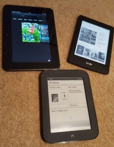
I don’t think it’s just me. On my commuting journeys I see people reading all kinds of things – newspapers, books, magazines, Kindles, phones, tablets and so on. I really cannot remember the last time I saw somebody reading a piece of hand-written material on the tube.
Now, to set against that, I have friends and relatives for whom the act of writing is still important. They would say that the nature of the writing surface and the writing implement – pencil, biro, fountain pen – are important ingredients, and that bodily engagement with the process conveys something extra than simply the production of letters. Emphasis and emotion are easier to impart – they say – when you are personally fashioning the outcome. To me, this seems simply a temporary problem of the tools we are using, but we shall see.
Looking ahead, I cannot imagine a time when reading skills won’t be necessary – there are far too many situations where you have to pore over things in detail, review what was written a few chapters back, compare one thing against another, or just enjoy the artistry with which the text had been put together. Just to recognise which letter to tap or click requires that I be able to read. But hand-writing? I’m not at all sure this will survive much longer.
Perhaps a time will come when teaching institutions will not consider it worth while investing long periods of time in getting children’s hand-writing to an acceptable standard – after all, pieces of quality writing can be generated by several other means.
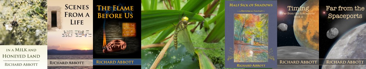
I’ve been thinking these last few days, once again, about language and pronunciation. This was triggered by working on some more Alexa skills to do with my books. For those who don’t know, I have such things already in place for Half Sick of Shadows, Far from the Spaceports, and Timing. That leaves the Bronze Age series set in Kephrath, in the hill country of Canaan. And here I ran into a problem. Alexa does pretty well with contemporary names – I did have a bit of difficulty with getting her to pronounce “Mitnash” correctly, but solved that simply by changing the spelling of the text I supplied. If instead of Mitnash I wrote Mitt-nash, the text-to-speech engine had enough clues to work out what I meant.
So far so good, but you can only go part of the way down that road. You can’t keep fiddling around with weird spellings just to trick the code into doing what you want. Equally, it’s hardly reasonable to suppose that the Alexa coding team would have considered how to pronounce ancient Canaanite or Egyptian names. Sure enough the difficulties multiplied with the older books. Even “Kephrath” came out rather mangled, and things went downhill from there.
Amazon Dot – Inactive
So I took a step back, did some investigation, and found that you can define the pronunciation of unusual words by using symbols from the phonetic alphabet. Instead of trying to guess how Alexa might pronounce Giybon, or Makty-Rasut, or Ikaret, I can simply work out what symbols I need for the consonants and vowels, and provide these details in a specific format. Instead of Mitnash, I write mɪt.næʃ. Ikaret becomes ˈIk.æ.ˌɹɛt.
So that solved the immediate problem, and over the next few days my Alexa skills for In a Milk and Honeyed Land, Scenes from a Life, and The Flame Before Us will be going live. Being slightly greedy about such things, of course I now want more! Ideally I want the ability to set up a pronunciation dictionary, so that I can just set up a list of standard pronunciations that Alexa can tap into at need – rather like having a custom list of words for a spelling checker. Basically, I want to be able to teach Alexa how to pronounce new words that aren’t in the out-of-the-box setup. I suspect that such a thing is not too far away, since I can hardly be the only person to come across this. In just about every specialised area of interest there are words which aren’t part of everyday speech.
Amazon Dot – Active
But also, this brought me into contact with the perennial issue of UK and US pronunciation. Sure, a particular phonetic symbol means whatever it means, but the examples of typical words vary considerably. As a Brit, I just don’t pronounce some words the same as my American friends, so there has to be a bit of educated guesswork going into deciding what sound I’m hoping for. Of course it’s considerably more complicated than just two nations – within those two there are also large numbers of regional and cultural shifts. And of course there are plenty of countries which use English but sound quite different to either “standard British” or “standard American”.
That’s for some future, yet to be invented, dialect-aware Alexa! Right now it’s enough to code for two variations, and rely on the fact that the standard forms are recognisable enough to get by. But wouldn’t it be cool to be able to insert some extra tags into dialogue in order to get one character’s speech as – say – Cumbrian, and another as from Somerset.
Today’s blog looks at bugs – the little things in a system that can go so very wrong. But before that – and entirely unrelated – I should mention that Half Sick of Shadows is now available in paperback form as well as Kindle. You can find the paperback at Amazon UK link, Amazon US link, and every other Amazon worldwide site you favour. So whichever format you prefer, it’s there for you.
So, bugs. In my day job I have to constantly think about what can go wrong with a system, in both small and large ways. No software developer starts out intending to write a bug – they appear, as if by magic, in systems that had been considered thoroughly planned out and implemented. This is just as true of hacking software, viruses and the like, as it is of what you might call positively motivated programs. It’s ironic really – snippets of code designed to take advantage of flaws in regular software are themselves traced and blocked because of their own flaws.
Cover – I, Robot (Goodreads)
But back to the practice of QA – finding the problems and faults in a system thought to be correct. You could liken it, without too much of a stretch, to the process of writing. Authors take a situation, or a relationship, or a society, and find the unexpected weak points in it. Isaac Asimov was particularly adept at doing this in his I, Robot series of stories. At the outset he postulated three simple guidelines which all his robots had to follow – guidelines which rapidly caught on with much wider audiences as the “Three Laws of Robotics”. These three laws seemed entirely foolproof, but proved themselves to be a fertile ground for storytelling as he came up with one logical contradiction after another!
But it’s not just in coding software that bugs appear. Wagon wheels used to fall off axles, and I am told that the root cause was that the design was simply not very good. Road layouts change, and end up causing more delays than they resolve. Mugs and jugs spill drink as you try to pour, despite tens of thousands of years of practice making them. And I guess we have all come across “Friday afternoon” cars, tools, cooking pans and so on.
1947 bug found and taped to the engineering logbook (Wikipedia)
Bugs can be introduced in lots of places. Somebody thinks they’ve thought up a cool design, but they didn’t consider several important features. Somebody thinks they’ve adequately explained how to turn a design into a real thing, but their explanation is missing a vital step or two – how many of us have foundered upon this while assembling flat-pack furniture? Somebody reads a perfectly clear explanation, but skips over bits which they think they don’t need. Somebody doesn’t quite have the right tool, or the right level of skill, and ploughs on with whatever they have. Somebody realises that a rare combination of factors – what we call an edge case, or corner case – has not been covered in the design, and makes a guess how it should be tackled rather than going back to the designer. Somebody adds a new feature, but in doing so breaks existing functionality which used to work. Somebody makes a commercial decision to release a product before it’s actually ready (as a techie, I find this one particularly frustrating!)
And then you get to actual users. So many systems would work really well if it wasn’t for end-users! People will insist on using the gadget in ways that were never anticipated, or trying out combinations of things that were never thought about. A feature originally intended for use in one way gets pressed into service for something entirely different. People don’t provide input data in the way they’re supposed to, or they don’t stick to the guidelines about how the system is intended to work – and very few of us read the guidelines in the first place!
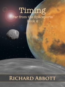
Timing Kindle cover
All of which have direct analogies in writing. Some of my books are indeed focused on software, and in particular the murky business of exploiting software for purposes of fraud. That world is full of flaws and failures, of the misuse of systems in both accidental and deliberate ways. But any book – past, present or future – is much the same. A historical novel might explore how a battle is lost because of miscommunication, human failings, or simply bad timing. Poor judgement leads to stories in any age. Friction in human relationships is a perennial field of study. So the two worlds I move in, of working life and leisure, are not really so far apart.
Now, engineering systems, including software engineering – have codes and guidelines intended to identify bugs at an early stage, before they get into the real world of users. The more critical the system, the more stringent the testing. If you write a mobile phone game, the testing threshold is very low! If you write software that controls an aircraft in flight, you have to satisfy all kinds of regulatory tests to show that your product is fit for purpose. But it’s a fair bet that any system at all has bugs in it, just waiting to pop out at an inopportune moment.
As regards writing, you could liken editing to the process of QA. The editor aims to spot slips in the writing – whether simply spelling and grammar, or else more subtle issues of style or viewpoint – and highlight them before the book reaches the general public. We all know that editing varies hugely, whoever carries it out. A friend of mine has recently been disappointed by the poor quality of editing by a professional firm – they didn’t find anywhere near all the bugs that were present, and seem to have introduced a few of their own in the process. But just as no software system can honestly claim to be bug-free, I dare say that no book is entirely without flaw of one kind or another.
Last time in this series we looked at some of the difficulties of presenting a book in an electronic medium, where the layout on every page can change according to user settings and from one device to another. In particular, there is the problem of handling the two extremes – small or large font size compared with screen width. At one end of the spectrum you get a lot of words per line, and the tendency for the eye to lose its place in a screen full of text. At the other, with few words per line, word spacing becomes irregular and “rivers” of white space tend to open up.
Flush layout with large gaps
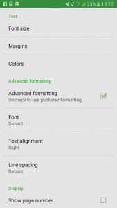
On grounds of aesthetic appearance and readability studies, there is broad agreement that left-aligned text is preferable in the limit of few words per line. For many words per line, text which is flush both sides is more familiar and traditional, giving an impression of neatness. The question then arises, is it possible to have the best of both worlds?
Now with traditional print layout, all of this is decided by author or publisher, and the reader has no choice. Once the design is chosen, that’s it. The phenomenal rise of epublishing, with free and easy to use tools enabling indie publishing, has given huge empowerment to authors. But I sometimes think that authors have not caught on to the fact that it has also given huge empowerment to readers, who want to exercise their freedom of choice to change the layout of the book to suit their own preferences.
So what does that mean for Kindle formatting? A Kindle or ebook is basically a long thin web site, conveniently represented in pages by software or hardware. The basic building blocks are HTML files and CSS style sheets, together with some added contextual information to tie the whole lot together. This is hidden from many authors, who may simply upload a Word document to an aggregator site which itself does the difficult work.
New model Kindle with automatic left alignment
But being essentially a web page gives access to another set of options. Ebook devices like Kindle do not usually support everything that a real web site would – for example you cannot use script commands to query the settings in a dynamic way. But there is support for something called a media query, embedded inside the style settings. Media queries are often used to render a page suitable for printing, or for voice readers, or to accommodate a wide range of screen sizes from mobile to wall-mounted TV with the same basic design. So Kindle books can be responsive, but not dynamic in the strict technical sense.
Regular media queries are of limited use here – in terms of pixels or centimetres, the screen is what it is. Happily, there is a fairly straightforward solution. A web device – including an ereader – allows widths to be specified in a unit called em. An em is directly related to the font size, unlike physically derived units like pixels or centimetres. So while the size of the screen stays the same in terms of pixels, it changes in terms of ems as different fonts are selected. Better still, the em width also varies as the user chooses different margin widths. For a standard device font at default size, by convention 1em = 16px. But this can be changed in various ways, including user selection of font size and page margin.
So here is the way to have an ebook layout which is responsive to user choices. It’s not as flexible as what you can do in a real web site, but then the device doesn’t allow you to make so many adjustments. Anyway, it’s a whole lot better than having a one-size-fits-all compromise. Basically you can have a different set of style rules for large fonts than for small ones, and so maintain appearance across a very wide range of settings. Left alignment is easier for the eye to follow with only a few words per line – and avoids the tendency of justified text to leave large rivers of white space in the middle of pages. Justified text is preferred where there are lots of words per line. Newer versions of the Android and iPhone apps make this choice for themselves unless told otherwise, but most actual Kindles do not. With media queries you don’t have to pick one or the other and make do – you can have both, as part of a responsive Kindle design. You can have as many multiple separate queries as you wish, though personally for simplicity I would tend to stick with two – one for large fonts (compared to screen width) and one for small. Similar comments apply to paragraph settings – regular spacing with indent, or a small vertical gap with no indent.
Media Query Definition
What are the rules to follow here? Well, firstly you should always have a default set of styles which apply in the absence of more specific choices. And the default ones should always go first, and those governed by a media query afterwards. That’s because of how the style sheet is parsed – the whole file from start to finish, and any later directives which happen to apply are chosen in preference to earlier ones.
Finally, do keep it simple. Media query support, along with style sheet support in general, is patchy on most ereaders. The number of legacy and old-model systems is high, for several reasons. People hang on to their Kindles for a long time, so long as they continue to function. Many software companies producing phone and tablet reader apps don’t bother to code for recent enhancements, reckoning that the extra investment in time is not worth it. So any media queries used in a Kindle or generic epub book must be simple. It would be great to have different styles for whether your reader has chosen normal screen (dark text on pale background) or inverted (pale on dark), or indeed the several colour options available on some devices. But support for the media queries “inverted-colors” and “color-depth” is very erratic and cannot be relied upon. So you should not specify colours in your style which might end up unreadable for the colour scheme chosen by your readers. Better to avoid colours altogether and just let the device choose.
One epub reader options
As I have said several times, not all Kindle devices, or Kindle software apps on computers, phones and tablets, treat the content the same way. My phone Kindle app (both Android and iPhone) handles changes of font size differently from my various actual Kindles, including the way it decides to justify text. This is something built into the app itself, not a thing I have direct control over. I like some reading preferences that other people don’t, so anything that you as author do by way of styles and media queries should not intrude on personal preference.
I started with some screenshots of how things would be if you had to make do with just one style, and moreover used measurements in fixed units. Here by contrast is the same content, using media queries and a responsive design. Personally I like the flexibility, and the way the presentation adapts to changes in user choices. Not everybody will, and maybe not everybody will want to dig in to the details of how their Kindle or epub book is being constructed. Those who simply hand over a Word document to Smashwords or a similar site may be perplexed by all this.
Authors spend a great deal of time and effort researching the background to their books. They look out for what they consider a good cover. They may pay for the services of an editor. Yet many authors dislike the thought of engaging with the technology that finally delivers their book into the reader’s hands. By way of doing something, many just try to copy the methods they used for print. But ebooks are a different medium to print, and need their own treatment. Happily, it is relatively easy to offer a better reading experience for those who want it. Complete consistency across devices is not possible, but through media queries and the use of ems to measure dimensions we can get a good way towards that.
This is almost the end of this little series, and the last item will be a quick summary of key points.
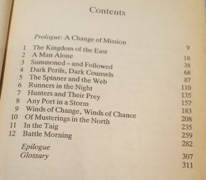
A shorter blog today focusing specifically on navigation. I mentioned before that there were two different ways of navigating through the sections of an ebook, and this little post will focus on how they work. The two methods appear differently in the book – the HTML contents page is part of the regular page flow of the book, and the NCX navigation is outside of the pages, as we’ll see later.
Print Book TOC
It’s an area where ebooks behave quite differently to print versions. If you have a table of contents (TOC) in a print book it’s essentially another piece of static text, listing page numbers to turn to. Nonfiction books frequently have other similar lists such as tables or pictures, but I’ll be focusing only on section navigation – usually chapters but potentially other significant divisions. In an ebook this changes from a simple static list into a dynamic means of navigation.
TOC navigation page
Let’s take the HTML contents first. It looks essentially the same as the old print TOC, except that the page numbers are omitted (since they have no real meaning) and are replaced by dynamic links. Tap the link and you go to the corresponding location. They look just like links in a web page, for the very good reason that this is exactly what they are!
So the first step is to construct your HTML contents list, for which you need to know both the visible text – “Chapter 1”, perhaps – and the target location. Authors who use Word or a similar tool can usually generate this quite quickly, while those of us who work directly with source files have the easy task of inserting the anchor targets by hand. It’s entirely up to you how you style and structure your contents page – maybe it makes sense to have main parts and subsections, with the latter visually indented. It’s your choice.
Missing NCX navigation
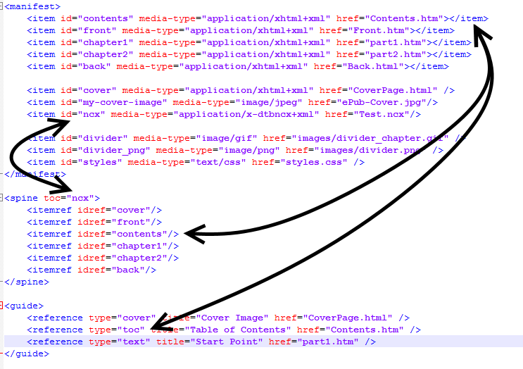
The NCX navigation is a bit different. It’s a separate file, and the pairing of visible text and target link is done by means of an XML files of a specific structure. Again. some commercial software will be able to generate this for you, using the HTML TOC as a starting point, but it’s as well to know what it is doing for you. Conventionally the two lists of contents mirror each other, but this doesn’t have to be the case. For example, it might suit you better to have the HTML version with an exhaustive list, and the NCX version with just a subset. It’s up to you. However, the presence of NCX navigation in some form is a requirement of Amazon’s, sufficiently so that they reserve the right to fail validation if it’s not present. And it’s a mandatory part of the epub specifications, and a package will fail epubcheck if NCX is missing. You’ll get an error message like this:
Validating using EPUB version 2.0.1 rules. ERROR(RSC-005): C:/Users/Richard/Dropbox/Poems/test/Test.epub/Test_epub.opf(39,8): Error while parsing file ‘element “spine” missing required attribute “toc”‘. ERROR(NCX-002): C:/Users/Richard/Dropbox/Poems/test/Test.epub/Test_epub.opf(-1,-1): toc attribute was not found on the spine element.
Partial NCX file
Of course, if you don’t check for validation, or if you just use Kindlegen without being cautious, you will end up with an epub or Kindle mobi file that you can ship… it will just be lacking an important feature.
Interestingly, you don’t get an error if you omit the HTML TOC – so long as everything else is in order, your epub file will pass validation just fine. This is the opposite of what folk who are used to print books might guess, but it reflects the relative importance of NCX and HTML contents tables in an ebook.
NCX navigation included
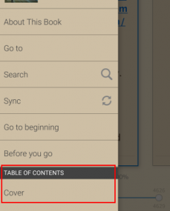
So what exactly do they each do? The main purpose of the HTML version is clear – it sits at the front of the book so that people can jump directly to whatever chapter they want. It would do this even if you just included the file in the spine listing. But if you are careful to specify its role in the OPF file, it also enables a link in the overall Kindle (or epub) navigation. This way the user can jump straight to the TOC from anywhere.
The NCX navigation enables the rest of this “Go To” menu. If it’s missing, or incorrectly hooked up in the OPF file, the navigation will be missing, and you are leaving your readers struggling to work out how to flick easily to and fro. On older Kindles, there were little hardware buttons (either on the side of the casing or marked with little arrows on the front) which would go stepwise forwards and backwards through the NCX entries.
So that’s it for the two kinds of navigation. They’re easy to include, they add considerably to the user experience, and in one way or another are considered essential.
This is the first of an occasional series on the quirks of preparing ebooks. Almost everything applies equally to Kindle and general epub, but for the sake of quickness I shall normally just write “Kindle”.
The conversion of a manuscript written in some text editor through to a built ebook – a mobi or epub file – happens in several logical stages. A lot of authors aren’t really aware of this, and just use a package which does the conversion for them. Later in this series I’ll talk a bit about how Amazon’s software – KindleGen – does this, and what parts of your input end up doing what.
Changing the name of an epub file
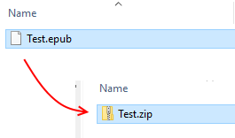
First, what is a ebook? You can see this best with a generic epub file. Find such a file on your system, then make a copy so you don’t accidentally corrupt your original. Let’s say it’s Test.epub. Rename it to Test.zip and give approval if your computer warns you about changing file extension.
Contents of epub file
Then you can look inside the contents and see what’s there – a very specific folder structure together with a bunch of content files. This is what your epub reader device or app turns into something that looks like a book. This list not only lists the files, but (presupposing you’ve given sensible names to the source files) it tells you something about their purpose. The ones identified as HTML Documents are basically the text of the book, including the contents listing and any front and back matter the author chooses to put in. The document styles are there. There’s a cover image. The ncx file describes how the Kindle or epub reader will navigate through the book (of which more another time). The opf file is the fundamental piece of the jigsaw that defines the internal layout. The images folder contains, well, images used. The other files are necessary components to enable the whole lot to make sense to the reading app or device.
A Kindle mobi file is much the same except that there is usually some encryption and obfuscation to dissuade casual hacking. But actually, almost exactly the same set of files is assembled into a mobi file. What KindleGen does is rearrange your source files – whether you use Word, plain text, or some other format – into this particular arrangement. By the same token, if you are careful to get everything in exactly the right place, you can create your epub file with nothing more than a plain text editor and something that will make a zip archive out of the files.
Some Phone Ebook Readers
So now we know that a Kindle “book” is actually a very long thin web site, divided up into convenient “pages” by the device or by an app. Kindle books never scroll like a regular web site, though a small number of epub apps do. They show the content in pages which replace each other, rather than an endless vertical scroll. There’s a good reason for that – readability studies have shown that presentation by means of pages is more easily read and comprehended than scrolling. The layout chosen by most word processors – a continuous scroll with some kind of visual cue about page divisions – is good for editing, since you can see the bottom of one page and the top of the next at the same time, but it’s not so good for readability. The scrolling choice made by some epub apps is due to developer laziness rather than any logical reason – and even here, some apps allow the reader to choose how they move through the book
Aldiko Reader options
So the underlying structure is entirely different from the fixed layout called for by a printed book or its computer equivalent such as a pdf or Word document, even if the superficial appearance is similar. On a computer, you can resize the window containing your pdf as much as you like, and the words will stay in the same place on each line of each page. But with Kindle or epub, you can swap between portrait and landscape view, or alter font and margin size, or change line spacing, and in each case the words on the lines will reflow to fit. In the landscape aspect of some Kindles you can choose to view in two columns side by side. In most epub readers you can choose to override whatever text alignment the author or publisher has chosen, and read it however you like. After each such change the device or app recalculates how to lay out the text.
Now many of us choose to use some sort of word processor to write our story, in which none of this is very visible. You can certainly alter the page settings and experiment, but most people just set it to whatever their typical national page size is – A4, or Letter, for example – and leave it at that. That gives the illusion that the process of production is fundamentally the same as that of a printed book – but in fact it is not. If an author’s main intention is to write a paperback book, and they perceive the Kindle version is just a handy spinoff, then focusing on page layout seems to make sense. But most indie authors sell a lot more ebooks than printed ones, so it makes more sense to understand the particular needs of the electronic medium.
Moon+ Reader options
You actually don’t need any extravagant software to create an ebook. A plain text editor, together with some knowledge of simple HTML tags, is all you need along with some other free tools. But for those of us who don’t have that knowledge, a word processor plus some sort of format converter is handy. But – as we shall see later – there are pitfalls with such software, and the end product is not necessarily as you would hope.
One of the really exciting features of an ebook is that it bridges two worlds which in the past have been separate – the world of traditional printing, and the world of visual and web design. This fusion opens up huge opportunities for the reader, but has also led to misunderstandings and difficulties. Some of the opportunities are obvious, like the ability to search, synchronise across multiple devices, swap between text and audio versions, and so on.
Kindle options (portrait mode)
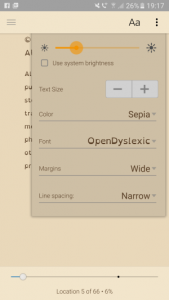
But there is much more. If I don’t like the original font, or I have dyslexia and prefer a specialised font, I can change it. If I need to expand the font size so I can read the text, I can do this. If I like a coloured page instead of black and white – and I have a device with a colour screen – I need only change a setting.
In all of this, the reader is not constrained by the author’s, or publisher’s choices. A great deal of display choice is where it should be – in the hands of the reader, not the writer. It seems to me that this fact has not been fully grasped by many authors, or small publishers, who sometimes treat an ebook as though it was no different from a printed book. They then expect to define every aspect of the display. But people who read ebooks have a considerable amount of choice over how they read – it’s a new world, and needs new thinking.
That’s it for today. Next time, I will be looking at some of the additional information that ties the separate content files together.
Today I thought I’d write about coding. Not in a technical manual, how to do your first “Hello World” widget kind of way, but just to give a general sense of how it’s done, and how things have changed over the years. This was prompted by the passages I have been writing for Timing recently, in which Mitnash and Slate have been crafting a fix for a particularly unpleasant hacking threat. The plot is all wrapped up in blackmail and personal relationships, but their ability to code is what gets them sent here and there. But first, let’s look back in time.
Colossus being operated at Bletchley Park (WIki)
Not so many years ago, computers were relatively simple things to work with. They didn’t look it – all the complexity was visible by way of valves and a spider’s web of cables connecting them. But the range of things you could tell them to do was quite limited. The available options were limited, and they were essentially isolated from each other. Today’s computers are almost the opposite – they look simple on the outside, but they have a hugely expanded range of capabilities, sensory inputs, and ways to communicate with nearby devices.
The art of the coder has changed along with that. Once upon a time the programmer had to do everything. If you wanted to draw a blob on a screen you had to know exactly which bit of memory to poke with which binary digit. You needed to master a whole range of disparate skills in order to accomplish quite modest tasks, and oftentimes you needed to deal with the innards of the machine’s firmware. Porting the results to a different machine was a serious challenge.
Neuframe (I worked on this, long ago)
Times have changed. If you need graphics animation, or remote communication, or artificial intelligence, there’s a library for that nowadays. Today’s coder relies on standard modules and frameworks, pulling in this one and that as the need arises. Moreover, he or she is insulated from the nuts and bolts of the device, so can write essentially the same program to run on a high-end server, a regular desktop or laptop, and any one of hundreds of different mobile devices. That is enormously liberating, but brings in a whole raft of new problems.
Does the borrowed code actually do what you want, neither less nor more? Do you trust the library writer with the innards of your system and, what is usually more precious, the data it contains? Does it already come with adequate security against hacking, or do you need something extra? On one level, the coder is freer than ever to be creative with a wealth of open source material, but to offset that, there’s a long and rather dull checklist to work through.
Some while ago I made the transition from pure development to testing and QA: it’s a decision I have had no cause to regret! I still get to write code, but it’s behind the scenes code to validate, or sometimes to challenge the work of others. QA has changed over the years alongside development. Once upon a time there was an adversarial relationship, where the two teams were essentially pitted one against the other by commercial structures, with almost no rapport or dialogue. That has largely gone, and the normal situation now is that developers and testers work together from the outset – a collaborative effort rather than competitive. There’s a lot of interest in strategies where you write the tests first, and then code in such a way as to ensure they pass, rather than test teams playing catch-up at the end of a project.
Coding and hacking are central to the plot of Far from the Spaceports, and its successor Timing. Hacking, then and now, isn’t necessarily bad. It all depends on the motive and intentions of the hacker, and the same techniques can be used for quite opposite purposes. Some of the time Mitnash and Slate are hacking; some of the time they are defending against other people’s hacks.
I have taken the line that the (future hypothetical) work of the ECRB, to – protect financial institutions against fraud and theft, would need a freelance coder more than a policeman. Moving from place to place around the solar system’s settlements takes weeks or months, and even message signals can take hours. It seems to me that it would be much more efficient for ECRB to send someone who could actually identify and fix a problem, rather than someone who might just chase after a perpetrator.
On one level, Mitnash has it easy. He can pass all the necessary but time-consuming work of testing, validating, and productionising his code to somebody else. If I ever worked with him, I’d get frustrated by his cavalier attitude to the basic constraints of working in a team, and his casual approach to QA. But then, he gets to travel out to Mars and beyond, and has Slate as his team partner.
Artist’s impression: Dawn, Ceres and Vesta (NASA/JPL)
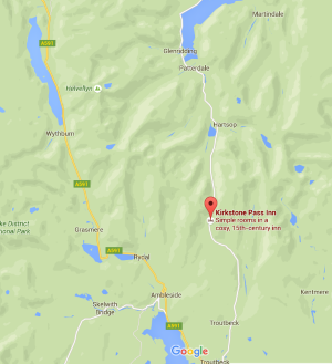
In all my years of visiting the Lake District, I had never before been through the Kirkstone Pass. It sits between the lakes of Ullswater and Windermere, and is fairly remote from the northern and central areas I normally go to. But with the A591 road from Keswick to Grasmere still closed from the winter storms, this remote route is the quickest way to make the journey down to Ambleside.
Within the mind strong fancies work, A deep delight the bosom thrills, Oft as I pass along the fork Of these fraternal hills: Where, save the rugged road, we find No appanage of human kind, Nor hint of man;…
Who comes not hither ne’er shall know How beautiful the world below; Nor can he guess how lightly leaps The brook adown the rocky steeps.
The hills above the pass
His main concern was the feeling of absolute removal from the built things of mankind, and the way purely natural objects came to attain a significance beyond the normal. The pass gets its name from a large rock that has the shape of a church – a kirk. Along with that, he pondered, as perhaps most people do after reaching the summit of the pass, on the generations that had done the same journey:
When through this height’s inverted arch Rome’s earliest legion passed!
Now, on a purely objective scale, the Kirkstone Pass is the highest in Cumbria – nearly 1500′ – and it certainly feels that way. As well as a few hundred feet advantage over, say, the Honister Pass, the approach from Patterdale is so long and bleak that the sense of relief on getting to the top is very pronounced!
The Windermere valley in mist
Now, on the day I was there, the most extraordinary sight awaited, with the Windermere valley stretching ahead to the south completely full of cloud. The way up had been under clear skies, and the mist was dissolving minute by minute. Already the side-road down – The Struggle – is becoming visible.
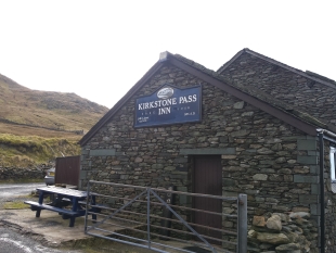
The Kirkstone Pass Inn
The Kirkstone Pass Inn has a sign suggesting to travellers that it has been in action since the 15th century. This is something of artistic licence, since for many of the intervening years the place seems to have lain in ruins. But – so far as one can tell – there has been a building on this spot serving drink to weary passers-by for many of those years. Every now and again, the sheer difficulty of getting there, and the bleakness of the existence in long cold winters, forced the occupants back down to the valleys. It is, after all, the highest inhabited house in Cumbria. But if you can handle the emptiness, it is a great place for a pub! On occasion, it has also served as a retreat for monks, presumably of an order that wanted to retreat from worldly distractions.
I also learned that this Inn is considered one of the most haunted places in England. Many of the apparitions are those of people who died tragically on the road – typically within sight of the homely walls but unable to reach them. These are – by repute, at least – benevolent towards the living. But other ghosts have a more sinister reputation, and tales are told of groups cancelling reservations after a first, sleepless night. I didn’t test out the ghost stories, but instead turned down the road to Ambleside, thinking to myself that there have to be some good stories that tap into the history of this place.