Last time in this series we looked at some of the difficulties of presenting a book in an electronic medium, where the layout on every page can change according to user settings and from one device to another. In particular, there is the problem of handling the two extremes – small or large font size compared with screen width. At one end of the spectrum you get a lot of words per line, and the tendency for the eye to lose its place in a screen full of text. At the other, with few words per line, word spacing becomes irregular and “rivers” of white space tend to open up.
On grounds of aesthetic appearance and readability studies, there is broad agreement that left-aligned text is preferable in the limit of few words per line. For many words per line, text which is flush both sides is more familiar and traditional, giving an impression of neatness. The question then arises, is it possible to have the best of both worlds?
Now with traditional print layout, all of this is decided by author or publisher, and the reader has no choice. Once the design is chosen, that’s it. The phenomenal rise of epublishing, with free and easy to use tools enabling indie publishing, has given huge empowerment to authors. But I sometimes think that authors have not caught on to the fact that it has also given huge empowerment to readers, who want to exercise their freedom of choice to change the layout of the book to suit their own preferences.
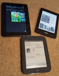
So what does that mean for Kindle formatting? A Kindle or ebook is basically a long thin web site, conveniently represented in pages by software or hardware. The basic building blocks are HTML files and CSS style sheets, together with some added contextual information to tie the whole lot together. This is hidden from many authors, who may simply upload a Word document to an aggregator site which itself does the difficult work.
But being essentially a web page gives access to another set of options. Ebook devices like Kindle do not usually support everything that a real web site would – for example you cannot use script commands to query the settings in a dynamic way. But there is support for something called a media query, embedded inside the style settings. Media queries are often used to render a page suitable for printing, or for voice readers, or to accommodate a wide range of screen sizes from mobile to wall-mounted TV with the same basic design. So Kindle books can be responsive, but not dynamic in the strict technical sense.
Regular media queries are of limited use here – in terms of pixels or centimetres, the screen is what it is. Happily, there is a fairly straightforward solution. A web device – including an ereader – allows widths to be specified in a unit called em. An em is directly related to the font size, unlike physically derived units like pixels or centimetres. So while the size of the screen stays the same in terms of pixels, it changes in terms of ems as different fonts are selected. Better still, the em width also varies as the user chooses different margin widths. For a standard device font at default size, by convention 1em = 16px. But this can be changed in various ways, including user selection of font size and page margin.
So here is the way to have an ebook layout which is responsive to user choices. It’s not as flexible as what you can do in a real web site, but then the device doesn’t allow you to make so many adjustments. Anyway, it’s a whole lot better than having a one-size-fits-all compromise. Basically you can have a different set of style rules for large fonts than for small ones, and so maintain appearance across a very wide range of settings. Left alignment is easier for the eye to follow with only a few words per line – and avoids the tendency of justified text to leave large rivers of white space in the middle of pages. Justified text is preferred where there are lots of words per line. Newer versions of the Android and iPhone apps make this choice for themselves unless told otherwise, but most actual Kindles do not. With media queries you don’t have to pick one or the other and make do – you can have both, as part of a responsive Kindle design. You can have as many multiple separate queries as you wish, though personally for simplicity I would tend to stick with two – one for large fonts (compared to screen width) and one for small. Similar comments apply to paragraph settings – regular spacing with indent, or a small vertical gap with no indent.
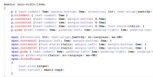
What are the rules to follow here? Well, firstly you should always have a default set of styles which apply in the absence of more specific choices. And the default ones should always go first, and those governed by a media query afterwards. That’s because of how the style sheet is parsed – the whole file from start to finish, and any later directives which happen to apply are chosen in preference to earlier ones.
Finally, do keep it simple. Media query support, along with style sheet support in general, is patchy on most ereaders. The number of legacy and old-model systems is high, for several reasons. People hang on to their Kindles for a long time, so long as they continue to function. Many software companies producing phone and tablet reader apps don’t bother to code for recent enhancements, reckoning that the extra investment in time is not worth it. So any media queries used in a Kindle or generic epub book must be simple. It would be great to have different styles for whether your reader has chosen normal screen (dark text on pale background) or inverted (pale on dark), or indeed the several colour options available on some devices. But support for the media queries “inverted-colors” and “color-depth” is very erratic and cannot be relied upon. So you should not specify colours in your style which might end up unreadable for the colour scheme chosen by your readers. Better to avoid colours altogether and just let the device choose.
As I have said several times, not all Kindle devices, or Kindle software apps on computers, phones and tablets, treat the content the same way. My phone Kindle app (both Android and iPhone) handles changes of font size differently from my various actual Kindles, including the way it decides to justify text. This is something built into the app itself, not a thing I have direct control over. I like some reading preferences that other people don’t, so anything that you as author do by way of styles and media queries should not intrude on personal preference.
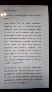
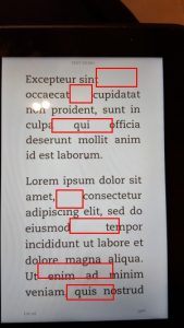
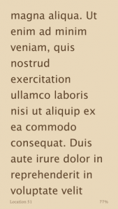
I started with some screenshots of how things would be if you had to make do with just one style, and moreover used measurements in fixed units. Here by contrast is the same content, using media queries and a responsive design. Personally I like the flexibility, and the way the presentation adapts to changes in user choices. Not everybody will, and maybe not everybody will want to dig in to the details of how their Kindle or epub book is being constructed. Those who simply hand over a Word document to Smashwords or a similar site may be perplexed by all this.
Authors spend a great deal of time and effort researching the background to their books. They look out for what they consider a good cover. They may pay for the services of an editor. Yet many authors dislike the thought of engaging with the technology that finally delivers their book into the reader’s hands. By way of doing something, many just try to copy the methods they used for print. But ebooks are a different medium to print, and need their own treatment. Happily, it is relatively easy to offer a better reading experience for those who want it. Complete consistency across devices is not possible, but through media queries and the use of ems to measure dimensions we can get a good way towards that.
This is almost the end of this little series, and the last item will be a quick summary of key points.