Category Archives: Formatting

Using IngramSpark

Kindle Cover - The Liminal Zone
Kindle Cover – The Liminal Zone

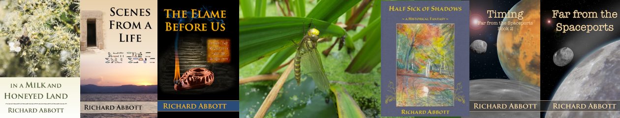
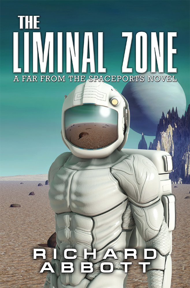
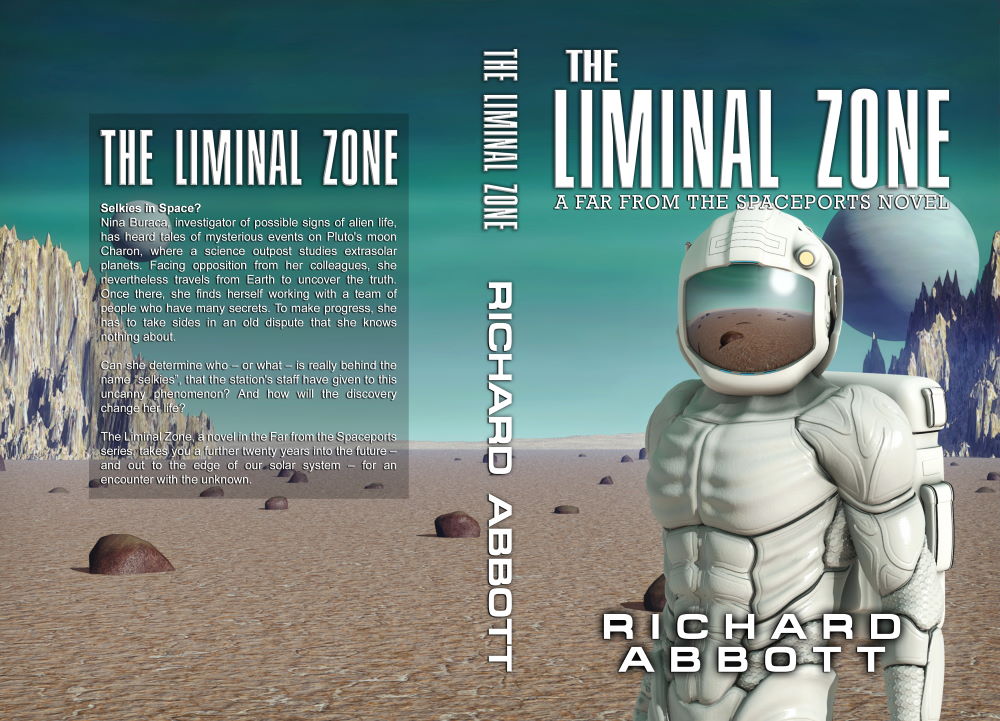
In something of a departure, I used IngramSpark (IS) as my print-on-demand supplier for The Liminal Zone, rather than Amazon’s CreateSpace (CS), which I used for my previous novels. This was largely at the suggestion of my local bookshop, who indicated that they would, and do, order from IS, but wouldn’t order from CS. Presumably the connection with Amazon as a commercial threat is too close for comfort. Now, I’d read occasional comments from other authors that they had had problems with IS, in particular with refusal to accept pdf files on submission. As things turned out, I had no problems with the internal part (the manuscript itself) and only one problem, easily resolved, with the cover.

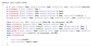
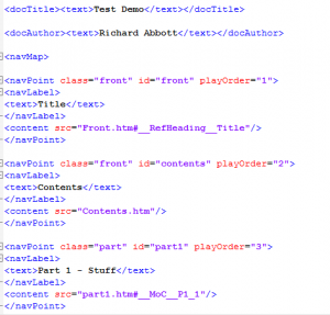
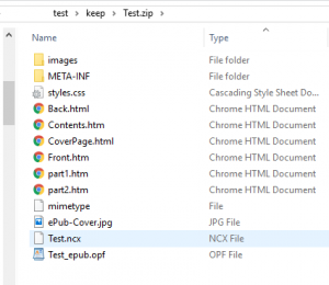
Now, readers of this blog will probably know that I am committedly geeky when it comes to generating manuscripts, and prefer to use a format method which is as close as possible to the one used by whatever software tool processes the manuscript. So for Kindle editions, I use HTML files, since that is what the Amazon tool kindlegen really prefers. Yes, it will accept other formats, and munch through them, but sometimes throws out formatting artefacts which are hard to resolve. By staying with HTML and similar files, I stay in control of the process. A typical kindlegen project looks like this:

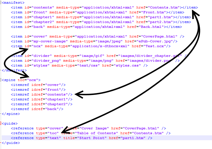
  • opf file – the overall controller file providing metadata like ISBN, keywords, description, etc, and identifying other components
  • multiple HTML files for the front and back matter, a contents page, and individual chapters
  • a stylesheet determining how things look
  • a cover image, in jpg or png format
  • other interior images, in any of several formats
  • an ncx file, which is equivalent to a table of contents but feeds in to the kindle hardware navigation, rather than being presented to the user inside the book

If you are so motivated, you can gather different elements in their own sub-folders inside the main project folder, just so long as the opf file points to the correct location.

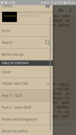
This structure has lots of advantages – first, it appeals to the programmer in me, who likes things to be laid out in a systematic and atomic manner, consistently between projects. Secondly, I can at any time generate a kindle version and deploy it to a real device, so I can catch layout weirdness early on, and also test out different viewing options that a reader might prefer. That’s hard to do if you just write in Word or a similar package. Finally, I can put placeholder content in at roughly the right location – for example my cover image for ages was nothing like the splendid one I ended up with, but was a rather boring image of the right dimensions. Likewise, I could work on sections at any point in the book, carry out edits, or simply tidy up the front and back matter if I felt lacking in inspiration.

What about the paperback? IS, just like CS and presumably every other print-on-demand supplier, wants to get from you a properly formatted pdf file which adheres to specific industry standards. And here is where some folk run into problems. It is entirely possible to generate pdf files from pretty much any program you choose – Word, Notepad, and so on – simply by selecting the print-to-pdf option in your menu. However, it turns out that individual software teams are not always as careful as they might be about the compliance of their print-to-pdf commands. Sure, you get something which will display in a web page, or whatever, but when given to something more particular about standards – like the IS submission process – things do not always come out right.

The Liminal Zone Paperback Cover

So I don’t use Word – instead I use an online tool which turns out pdf files which adhere to the relevant standards. The one I use is now called Overleaf (formerly ShareLatex) and was originally designed to help university staff and students to get their papers, dissertations, and whatever, correctly laid out. It is based on a text layout engine called latex, which contains all kinds of support for mathematical equations and the like – which I don’t need – but in particular allows settings for page size, running headers and footers, correct location of new chapters, font and style support, and such like. Even better, it is based on a project layout which is directly parallel to my Kindle layout above. The files have a .tex extension rather than .htm or .html, and there is no equivalent to the ncx file, but in other respects it all maps across.

Which is great – when I get to the stage of wanting a paperback version, I reproduce my Kindle project layout in a new Overleaf project, then copy across the text from my source files into the corresponding tex file, compile the whole, and voila… one standards-compliant pdf file. Now, that then generates a whole lot of additional work to check that characters are not spilling too far into the margins, and that widow and orphan lines are taken care of. Those edits have to be back-copied into the Kindle version. But it’s all very neat and orderly, and not only leaves me with a sense that all is properly organised, but also that the results are gong to be accepted first time. Which they were!

I mentioned that there was one small issue with the cover – this was a technical one relating to the use of what pdf standards designers call colour profiles. Basically these are a neat way to reduce file size by appealing to a commonly agreed list of colour mappings. It’s a great idea, but IS require cover files which don’t use them. Workaround – resave the file without the profile information, and accept the larger file size.

All in all, my experience with IS has been uniformly positive, and I would certainly choose them again.

Kindle preparation part 5 – formatting and media queries

Flush both sides working well

Last time in this series we looked at some of the difficulties of presenting a book in an electronic medium, where the layout on every page can change according to user settings and from one device to another. In particular, there is the problem of handling the two extremes – small or large font size compared with screen width. At one end of the spectrum you get a lot of words per line, and the tendency for the eye to lose its place in a screen full of text. At the other, with few words per line, word spacing becomes irregular and “rivers” of white space tend to open up.

Flush layout with large gaps

On grounds of aesthetic appearance and readability studies, there is broad agreement that left-aligned text is preferable in the limit of few words per line. For many words per line, text which is flush both sides is more familiar and traditional, giving an impression of neatness. The question then arises, is it possible to have the best of both worlds?

Now with traditional print layout, all of this is decided by author or publisher, and the reader has no choice. Once the design is chosen, that’s it. The phenomenal rise of epublishing, with free and easy to use tools enabling indie publishing, has given huge empowerment to authors. But I sometimes think that authors have not caught on to the fact that it has also given huge empowerment to readers, who want to exercise their freedom of choice to change the layout of the book to suit their own preferences.

So what does that mean for Kindle formatting? A Kindle or ebook is basically a long thin web site, conveniently represented in pages by software or hardware. The basic building blocks are HTML files and CSS style sheets, together with some added contextual information to tie the whole lot together. This is hidden from many authors, who may simply upload a Word document to an aggregator site which itself does the difficult work.

New model Kindle with automatic left alignment

But being essentially a web page gives access to another set of options. Ebook devices like Kindle do not usually support everything that a real web site would – for example you cannot use script commands to query the settings in a dynamic way. But there is support for something called a media query, embedded inside the style settings. Media queries are often used to render a page suitable for printing, or for voice readers, or to accommodate a wide range of screen sizes from mobile to wall-mounted TV with the same basic design. So Kindle books can be responsive, but not dynamic in the strict technical sense.

Regular media queries are of limited use here – in terms of pixels or centimetres, the screen is what it is. Happily, there is a fairly straightforward solution. A web device – including an ereader – allows widths to be specified in a unit called em. An em is directly related to the font size, unlike physically derived units like pixels or centimetres. So while the size of the screen stays the same in terms of pixels, it changes in terms of ems as different fonts are selected. Better still, the em width also varies as the user chooses different margin widths. For a standard device font at default size, by convention 1em = 16px. But this can be changed in various ways, including user selection of font size and page margin.

So here is the way to have an ebook layout which is responsive to user choices. It’s not as flexible as what you can do in a real web site, but then the device doesn’t allow you to make so many adjustments. Anyway, it’s a whole lot better than having a one-size-fits-all compromise. Basically you can have a different set of style rules for large fonts than for small ones, and so maintain appearance across a very wide range of settings. Left alignment is easier for the eye to follow with only a few words per line – and avoids the tendency of justified text to leave large rivers of white space in the middle of pages. Justified text is preferred where there are lots of words per line. Newer versions of the Android and iPhone apps make this choice for themselves unless told otherwise, but most actual Kindles do not. With media queries you don’t have to pick one or the other and make do – you can have both, as part of a responsive Kindle design. You can have as many multiple separate queries as you wish, though personally for simplicity I would tend to stick with two – one for large fonts (compared to screen width) and one for small. Similar comments apply to paragraph settings – regular spacing with indent, or a small vertical gap with no indent.

Media Query Definition

What are the rules to follow here? Well, firstly you should always have a default set of styles which apply in the absence of more specific choices. And the default ones should always go first, and those governed by a media query afterwards. That’s because of how the style sheet is parsed – the whole file from start to finish, and any later directives which happen to apply are chosen in preference to earlier ones.

Finally, do keep it simple. Media query support, along with style sheet support in general, is patchy on most ereaders. The number of legacy and old-model systems is high, for several reasons. People hang on to their Kindles for a long time, so long as they continue to function. Many software companies producing phone and tablet reader apps don’t bother to code for recent enhancements, reckoning that the extra investment in time is not worth it. So any media queries used in a Kindle or generic epub book must be simple. It would be great to have different styles for whether your reader has chosen normal screen (dark text on pale background) or inverted (pale on dark), or indeed the several colour options available on some devices. But support for the media queries “inverted-colors” and “color-depth” is very erratic and cannot be relied upon. So you should not specify colours in your style which might end up unreadable for the colour scheme chosen by your readers. Better to avoid colours altogether and just let the device choose.

One epub reader options

As I have said several times, not all Kindle devices, or Kindle software apps on computers, phones and tablets, treat the content the same way. My phone Kindle app (both Android and iPhone) handles changes of font size differently from my various actual Kindles, including the way it decides to justify text. This is something built into the app itself, not a thing I have direct control over. I like some reading preferences that other people don’t, so anything that you as author do by way of styles and media queries should not intrude on personal preference.

I started with some screenshots of how things would be if you had to make do with just one style, and moreover used measurements in fixed units. Here by contrast is the same content, using media queries and a responsive design. Personally I like the flexibility, and the way the presentation adapts to changes in user choices. Not everybody will, and maybe not everybody will want to dig in to the details of how their Kindle or epub book is being constructed. Those who simply hand over a Word document to Smashwords or a similar site may be perplexed by all this.

Authors spend a great deal of time and effort researching the background to their books. They look out for what they consider a good cover. They may pay for the services of an editor. Yet many authors dislike the thought of engaging with the technology that finally delivers their book into the reader’s hands. By way of doing something, many just try to copy the methods they used for print. But ebooks are a different medium to print, and need their own treatment. Happily, it is relatively easy to offer a better reading experience for those who want it. Complete consistency across devices is not possible, but through media queries and the use of ems to measure dimensions we can get a good way towards that.

This is almost the end of this little series, and the last item will be a quick summary of key points.

Some devices
Some devices

Kindle preparation part 4 – formatting

Some devices
Some devices

Kindle formatting has sometimes been the subject of intense debates. At one end of the spectrum there is a belief that it should mirror print conventions as far as possible. Alternatively, there is a contrasting belief that we have a new display medium which needs to be free to develop its own ideas. I’m inclined towards the second view, though I do think that some print conventions still have value. To extract parts of a long debate on The Passive Voice blog about text alignment, which attracted quite opposing views:

“Do not force the reader to read the way you want her to… Just get out of the way… Good readable text that flows nicely… keep it left justified… Is there anything that shouts ‘amateur and non-pro” more than a justified book?… I’ll take amateur and readable for people who read with large font sizes… There’s a lot to be said for left justification on a smaller screen with larger font”.

Obviously a lively topic. But first, there is the question of what is feasible. Some expectations may simply not be realistic, and we’ll come back to this later. Even if you restrict yourself to Kindle files, there is considerable variation in how the same file is displayed by different devices. Step away from Kindles into the diverse world of epub readers and reading apps, and the variation only increases. As usual, most of this post will talk about Kindles specifically, but an exactly parallel process applies to epub books.

Epub text alignment menu

Now, as well as differences between devices, you are faced with individual reader choices. A Kindle device, or a software app emulating a Kindle on a phone, tablet, or computer, places enormous flexibility of choice in the hands of the reader. The reader can change font, font size, margin width, line spacing, and background colour, as well as swap between portrait and landscape orientation. Many epub readers offer even more choices.

Now with traditional print layout, all of these are decided by author or publisher, and the reader has no choice. Once the design is chosen, that’s it. This has given rise over the years to a set of conventions for printed books. Not so with ebooks. The phenomenal rise of epublishing, with free and easy to use tools enabling indie publishing, has given huge empowerment to authors. But I sometimes think that authors have not caught on to the fact that it has also given huge empowerment to readers.

Kindle Options (Portrait)

As reader, I don’t have to put up with someone else’s choices. If I want a serif font instead of san serif – or a dyslexic-friendly font for that matter – or I like big text size, or wide margins, or two columns side by side, or different background colour, or whatever, I can choose that. If the author or publisher tries to stop me, I’ll get frustrated. It’s not appropriate any longer for an author to try to decide how a reader ought to read his or her book. Sometimes I hear people say that what matters is the layout of the book when originally downloaded, but this shows a misunderstanding of how the devices work. My reader settings are mine, and yours are yours, and they get applied equally to newly downloaded or existing books. There is nothing magic about the settings chosen by the author. If I want to read your ebook with right-aligned text, I can do so, and I can feel frustrated if you try to stop me.

Forced right-aligned text

As I mentioned before, not all Kindle devices, or Kindle software apps on computers, phones and tablets, treat the content the same way. My phone Kindle app (both Android and iPhone) handles changes of font size differently from my various actual Kindles, including the way it decides to justify text. This is something built into the app itself, not a thing I have direct control over.

So what does that mean for Kindle formatting? A layout that looks good when the font is small compared to the page width may well be confusing when the font is large. A layout that is easily readable when the font is large compared to the page size may well seem non-standard when the font is small.

New model Kindle with automatic left alignment

Now, being a new technology, and moreover one which has grown up linked closely to the world of web page design, there has been a great deal of systematic study of the readability of different styles. This hasn’t happened to the same degree with the world of print, except in the very specific area of font design. Some choices which are routinely made in a printed book, and which have become part of the lore of book production, were originally made for all kinds of diverse reasons including wartime economy. In particular, the normal print practice of justifying text both left and right is not based on considerations of readability, but rather on maximising the number of characters on what was a scarce resource – paper. Change the ratio of words per line significantly away from what is common for a novel, and flush-both-sides becomes rather unreadable, as reported by numerous systematic studies.

If the paper is wide compared to the typical word size, then your eye loses its ability to scan lines comfortably. This is why newspapers and magazines split text into columns – and why the landscape mode in recent ereaders gives the user the option to do just this.

Flush layout with large gaps

If the page is narrow compared to the words, there is a tendency for the layout to become erratic and irregular. Areas of open space appear, called “rivers”, creating a ragged and untidy appearance. Text which is left-aligned only, with ragged right margin, is better spaced, aesthetically more pleasing, and also more readable. In times past, the Kindle layout engine was heavily criticised for its poor showing in this area. It has improved, but is still way behind the result that can be achieved with a fixed page width. If you think about it, this is inevitable. Every time you change the font size, or the margin, or the aspect – even if you highlight a piece of text and then later jump back to it – every time something like this happens, the Kindle software has to recalculate the position of each word. You get huge advantages over a physical book with rigid layout, but you also have to recognise, and cope with, the limitations. Newer versions of the Kindle layout software deliberately switch to flush left only (ragged right) as the font size increases, to address this very issue.

Flush both sides working well

Readability considerations, then, suggest that flush-both-sides works best in the middle range of Kindle fonts, degrading in different ways as you go towards the extremes of size options. And although modern Kindles have recognised this, and provided a built-in solution, older ones do not. So next time we’ll look at another option that can be used by authors which they can control. For today, it’s enough to recognise that there is something to think about here, and that trying to simply copy what is done in print does not necessarily work well.

I mentioned earlier about things which are simply infeasible in ebooks, even though normal and appropriate in print. One of these concerns hyphenation. The print version, with fixed word positioning, can be carefully laid out to get hyphens in the perfect places. Kindle books can’t – any choice which is correct for one person’s device and settings will be wrong for the next. Recent software layout engines do a reasonable job of inserting hyphens, but they struggle with some words, especially proper nouns. You can easily see this if you find a book line with several long words, then expand the font size. At some point the layout engine just gives up.

Single line left at bottom after reflow

Another area is that of widows and orphans – single lines appearing at the bottom or top of a page, which are considered distracting to the reader. A publisher of a printed book tries hard to eliminate these by judicious choice of word selection and spacing. It can’t be done on a Kindle. If as author you did carefully sort all that out on your own device, it will all go wrong with a change of settings or on a new gadget.

So there are stylistic choices which are sound and reasonable in print, but which cannot be carried over to ebooks. It’s well worth thinking about this when you’re preparing a book, and only spending time on the issues that can be fixed. And do try out how the book appears when viewed with completely different user settings than the ones you personally like!

Kindle preparation part 3 – navigation

A shorter blog today focusing specifically on navigation. I mentioned before that there were two different ways of navigating through the sections of an ebook, and this little post will focus on how they work. The two methods appear differently in the book – the HTML contents page is part of the regular page flow of the book, and the NCX navigation is outside of the pages, as we’ll see later.

Print Book TOC
Print Book TOC

It’s an area where ebooks behave quite differently to print versions. If you have a table of contents (TOC) in a print book it’s essentially another piece of static text, listing page numbers to turn to. Nonfiction books frequently have other similar lists such as tables or pictures, but I’ll be focusing only on section navigation – usually chapters but potentially other significant divisions. In an ebook this changes from a simple static list into a dynamic means of navigation.

TOC navigation page
TOC navigation page

Let’s take the HTML contents first. It looks essentially the same as the old print TOC, except that the page numbers are omitted (since they have no real meaning) and are replaced by dynamic links. Tap the link and you go to the corresponding location. They look just like links in a web page, for the very good reason that this is exactly what they are!

So the first step is to construct your HTML contents list, for which you need to know both the visible text – “Chapter 1”, perhaps – and the target location. Authors who use Word or a similar tool can usually generate this quite quickly, while those of us who work directly with source files have the easy task of inserting the anchor targets by hand. It’s entirely up to you how you style and structure your contents page – maybe it makes sense to have main parts and subsections, with the latter visually indented. It’s your choice.

Missing NCX navigation

The NCX navigation is a bit different. It’s a separate file, and the pairing of visible text and target link is done by means of an XML files of a specific structure. Again. some commercial software will be able to generate this for you, using the HTML TOC as a starting point, but it’s as well to know what it is doing for you.  Conventionally the two lists of contents mirror each other, but this doesn’t have to be the case. For example, it might suit you better to have the HTML version with an exhaustive list, and the NCX version with just a subset. It’s up to you. However, the presence of NCX navigation in some form is a requirement of Amazon’s, sufficiently so that they reserve the right to fail validation if it’s not present. And it’s a mandatory part of the epub specifications, and a package will fail epubcheck if NCX is missing. You’ll get an error message like this:

Validating using EPUB version 2.0.1 rules.
ERROR(RSC-005): C:/Users/Richard/Dropbox/Poems/test/Test.epub/Test_epub.opf(39,8): Error while parsing file ‘element “spine” missing required attribute “toc”‘.
ERROR(NCX-002): C:/Users/Richard/Dropbox/Poems/test/Test.epub/Test_epub.opf(-1,-1): toc attribute was not found on the spine element.

Partial NCX file
Partial NCX file

Of course, if you don’t check for validation, or if you just use Kindlegen without being cautious, you will end up with an epub or Kindle mobi file that you can ship… it will just be lacking an important feature.

Interestingly, you don’t get an error if you omit the HTML TOC – so long as everything else is in order, your epub file will pass validation just fine. This is the opposite of what folk who are used to print books might guess, but it reflects the relative importance of NCX and HTML contents tables in an ebook.

NCX navigation included

So what exactly do they each do? The main purpose of the HTML version is clear – it sits at the front of the book so that people can jump directly to whatever chapter they want. It would do this even if you just included the file in the spine listing. But if you are careful to specify its role in the OPF file, it also enables a link in the overall Kindle (or epub) navigation. This way the user can jump straight to the TOC from anywhere.

The NCX navigation enables the rest of this “Go To” menu. If it’s missing, or incorrectly hooked up in the OPF file, the navigation will be missing, and you are leaving your readers struggling to work out how to flick easily to and fro. On older Kindles, there were little hardware buttons (either on the side of the casing or marked with little arrows on the front) which would go stepwise forwards and backwards through the NCX entries.

So that’s it for the two kinds of navigation. They’re easy to include, they add considerably to the user experience, and in one way or another are considered essential.

Mappings between items in OPF file

Kindle preparation part 1 – the background

Kindle and Epub Devices

This is the first of an occasional series on the quirks of preparing ebooks. Almost everything applies equally to Kindle and general epub, but for the sake of quickness I shall normally just write “Kindle”.

The conversion of a manuscript written in some text editor through to a built ebook – a mobi or epub file – happens in several logical stages. A lot of authors aren’t really aware of this, and just use a package which does the conversion for them. Later in this series I’ll talk a bit about how Amazon’s software – KindleGen – does this, and what parts of your input end up doing what.

Changing the name of an epub file

First, what is a ebook? You can see this best with a generic epub file. Find such a file on your system, then make a copy so you don’t accidentally corrupt your original. Let’s say it’s Test.epub. Rename it to Test.zip and give approval if your computer warns you about changing file extension.

Contents of epub file

Then you can look inside the contents and see what’s there – a very specific folder structure together with a bunch of content files. This is what your epub reader device or app turns into something that looks like a book. This list not only lists the files, but (presupposing you’ve given sensible names to the source files) it tells you something about their purpose. The ones identified as HTML Documents are basically the text of the book, including the contents listing and any front and back matter the author chooses to put in. The document styles are there. There’s a cover image. The ncx file describes how the Kindle or epub reader will navigate through the book (of which more another time). The opf file is the fundamental piece of the jigsaw that defines the internal layout. The images folder contains, well, images used. The other files are necessary components to enable the whole lot to make sense to the reading app or device.

A Kindle mobi file is much the same except that there is usually some encryption and obfuscation to dissuade casual hacking. But actually, almost exactly the same set of files is assembled into a mobi file. What KindleGen does is rearrange your source files – whether you use Word, plain text, or some other format – into this particular arrangement. By the same token, if you are careful to get everything in exactly the right place, you can create your epub file with nothing more than a plain text editor and something that will make a zip archive out of the files.

Phone Ebook Readers
Some Phone Ebook Readers

So now we know that a Kindle “book” is actually a very long thin web site, divided up into convenient “pages” by the device or by an app. Kindle books never scroll like a regular web site, though a small number of epub apps do. They show the content in pages which replace each other, rather than an endless vertical scroll. There’s a good reason for that – readability studies have shown that presentation by means of pages is more easily read and comprehended than scrolling. The layout chosen by most word processors – a continuous scroll with some kind of visual cue about page divisions – is good for editing, since you can see the bottom of one page and the top of the next at the same time, but it’s not so good for readability. The scrolling choice made by some epub apps is due to developer laziness rather than any logical reason – and even here, some apps allow the reader to choose how they move through the book

Aldiko Reader options

So the underlying structure is entirely different from the fixed layout called for by a printed book or its computer equivalent such as a pdf or Word document, even if the superficial appearance is similar. On a computer, you can resize the window containing your pdf as much as you like, and the words will stay in the same place on each line of each page. But with Kindle or epub, you can swap between portrait and landscape view, or alter font and margin size, or change line spacing, and in each case the words on the lines will reflow to fit. In the landscape aspect of some Kindles you can choose to view in two columns side by side. In most epub readers you can choose to override whatever text alignment the author or publisher has chosen, and read it however you like. After each such change the device or app recalculates how to lay out the text.

Now many of us choose to use some sort of word processor to write our story, in which none of this is very visible. You can certainly alter the page settings and experiment, but most people just set it to whatever their typical national page size is – A4, or Letter, for example – and leave it at that. That gives the illusion that the process of production is fundamentally the same as that of a printed book – but in fact it is not. If an author’s main intention is to write a paperback book, and they perceive the Kindle version is just a handy spinoff, then focusing on page layout seems to make sense. But most indie authors sell a lot more ebooks than printed ones, so it makes more sense to understand the particular needs of the electronic medium.

Moon+ Reader options

You actually don’t need any extravagant software to create an ebook. A plain text editor, together with some knowledge of simple HTML tags, is all you need along with some other free tools. But for those of us who don’t have that knowledge, a word processor plus some sort of format converter is handy. But – as we shall see later – there are pitfalls with such software, and the end product is not necessarily as you would hope.

One of the really exciting features of an ebook is that it bridges two worlds which in the past have been separate – the world of traditional printing, and the world of visual and web design. This fusion opens up huge opportunities for the reader, but has also led to misunderstandings and difficulties. Some of the opportunities are obvious, like the ability to search, synchronise across multiple devices, swap between text and audio versions, and so on.

Kindle options (portrait mode)

But there is much more. If I don’t like the original font, or I have dyslexia and prefer a specialised font, I can change it. If I need to expand the font size so I can read the text, I can do this. If I like a coloured page instead of black and white – and I have a device with a colour screen – I need only change a setting.

In all of this, the reader is not constrained by the author’s, or publisher’s choices. A great deal of display choice is where it should be – in the hands of the reader, not the writer. It seems to me that this fact has not been fully grasped by many authors, or small publishers, who sometimes treat an ebook as though it was no different from a printed book. They then expect to define every aspect of the display. But people who read ebooks have a considerable amount of choice over how they read – it’s a new world, and needs new thinking.

That’s it for today. Next time, I will be looking at some of the additional information that ties the separate content files together.