
Kindle formatting has sometimes been the subject of intense debates. At one end of the spectrum there is a belief that it should mirror print conventions as far as possible. Alternatively, there is a contrasting belief that we have a new display medium which needs to be free to develop its own ideas. I’m inclined towards the second view, though I do think that some print conventions still have value. To extract parts of a long debate on The Passive Voice blog about text alignment, which attracted quite opposing views:
“Do not force the reader to read the way you want her to… Just get out of the way… Good readable text that flows nicely… keep it left justified… Is there anything that shouts ‘amateur and non-pro” more than a justified book?… I’ll take amateur and readable for people who read with large font sizes… There’s a lot to be said for left justification on a smaller screen with larger font”.
Obviously a lively topic. But first, there is the question of what is feasible. Some expectations may simply not be realistic, and we’ll come back to this later. Even if you restrict yourself to Kindle files, there is considerable variation in how the same file is displayed by different devices. Step away from Kindles into the diverse world of epub readers and reading apps, and the variation only increases. As usual, most of this post will talk about Kindles specifically, but an exactly parallel process applies to epub books.
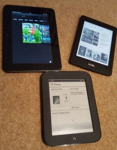
Now, as well as differences between devices, you are faced with individual reader choices. A Kindle device, or a software app emulating a Kindle on a phone, tablet, or computer, places enormous flexibility of choice in the hands of the reader. The reader can change font, font size, margin width, line spacing, and background colour, as well as swap between portrait and landscape orientation. Many epub readers offer even more choices.
Now with traditional print layout, all of these are decided by author or publisher, and the reader has no choice. Once the design is chosen, that’s it. This has given rise over the years to a set of conventions for printed books. Not so with ebooks. The phenomenal rise of epublishing, with free and easy to use tools enabling indie publishing, has given huge empowerment to authors. But I sometimes think that authors have not caught on to the fact that it has also given huge empowerment to readers.
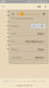
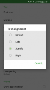
As reader, I don’t have to put up with someone else’s choices. If I want a serif font instead of san serif – or a dyslexic-friendly font for that matter – or I like big text size, or wide margins, or two columns side by side, or different background colour, or whatever, I can choose that. If the author or publisher tries to stop me, I’ll get frustrated. It’s not appropriate any longer for an author to try to decide how a reader ought to read his or her book. Sometimes I hear people say that what matters is the layout of the book when originally downloaded, but this shows a misunderstanding of how the devices work. My reader settings are mine, and yours are yours, and they get applied equally to newly downloaded or existing books. There is nothing magic about the settings chosen by the author. If I want to read your ebook with right-aligned text, I can do so, and I can feel frustrated if you try to stop me.
As I mentioned before, not all Kindle devices, or Kindle software apps on computers, phones and tablets, treat the content the same way. My phone Kindle app (both Android and iPhone) handles changes of font size differently from my various actual Kindles, including the way it decides to justify text. This is something built into the app itself, not a thing I have direct control over.
So what does that mean for Kindle formatting? A layout that looks good when the font is small compared to the page width may well be confusing when the font is large. A layout that is easily readable when the font is large compared to the page size may well seem non-standard when the font is small.
Now, being a new technology, and moreover one which has grown up linked closely to the world of web page design, there has been a great deal of systematic study of the readability of different styles. This hasn’t happened to the same degree with the world of print, except in the very specific area of font design. Some choices which are routinely made in a printed book, and which have become part of the lore of book production, were originally made for all kinds of diverse reasons including wartime economy. In particular, the normal print practice of justifying text both left and right is not based on considerations of readability, but rather on maximising the number of characters on what was a scarce resource – paper. Change the ratio of words per line significantly away from what is common for a novel, and flush-both-sides becomes rather unreadable, as reported by numerous systematic studies.
If the paper is wide compared to the typical word size, then your eye loses its ability to scan lines comfortably. This is why newspapers and magazines split text into columns – and why the landscape mode in recent ereaders gives the user the option to do just this.
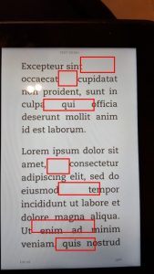
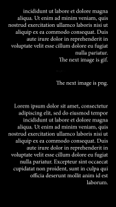
If the page is narrow compared to the words, there is a tendency for the layout to become erratic and irregular. Areas of open space appear, called “rivers”, creating a ragged and untidy appearance. Text which is left-aligned only, with ragged right margin, is better spaced, aesthetically more pleasing, and also more readable. In times past, the Kindle layout engine was heavily criticised for its poor showing in this area. It has improved, but is still way behind the result that can be achieved with a fixed page width. If you think about it, this is inevitable. Every time you change the font size, or the margin, or the aspect – even if you highlight a piece of text and then later jump back to it – every time something like this happens, the Kindle software has to recalculate the position of each word. You get huge advantages over a physical book with rigid layout, but you also have to recognise, and cope with, the limitations. Newer versions of the Kindle layout software deliberately switch to flush left only (ragged right) as the font size increases, to address this very issue.
Readability considerations, then, suggest that flush-both-sides works best in the middle range of Kindle fonts, degrading in different ways as you go towards the extremes of size options. And although modern Kindles have recognised this, and provided a built-in solution, older ones do not. So next time we’ll look at another option that can be used by authors which they can control. For today, it’s enough to recognise that there is something to think about here, and that trying to simply copy what is done in print does not necessarily work well.
I mentioned earlier about things which are simply infeasible in ebooks, even though normal and appropriate in print. One of these concerns hyphenation. The print version, with fixed word positioning, can be carefully laid out to get hyphens in the perfect places. Kindle books can’t – any choice which is correct for one person’s device and settings will be wrong for the next. Recent software layout engines do a reasonable job of inserting hyphens, but they struggle with some words, especially proper nouns. You can easily see this if you find a book line with several long words, then expand the font size. At some point the layout engine just gives up.
Another area is that of widows and orphans – single lines appearing at the bottom or top of a page, which are considered distracting to the reader. A publisher of a printed book tries hard to eliminate these by judicious choice of word selection and spacing. It can’t be done on a Kindle. If as author you did carefully sort all that out on your own device, it will all go wrong with a change of settings or on a new gadget.
So there are stylistic choices which are sound and reasonable in print, but which cannot be carried over to ebooks. It’s well worth thinking about this when you’re preparing a book, and only spending time on the issues that can be fixed. And do try out how the book appears when viewed with completely different user settings than the ones you personally like!