For today, a couple of things. The main one is a recap of the main points from the Kindle formatting series. But before getting to that, a quick digression into something else that has involved a lot of work over the last few months.

Lake View Country House, on the southern edge of Grasmere, Cumbria, is opening for the 2017 season tomorrow (Wednesday April 5th) after a major programme of refurbishment and renewal. Amongst other things, I am one of the contributors to the new blog there, which is part of the new web site. So have a read of the articles there, and subscribe for occasional news updates!
Back now to the world of ebooks, and a few highlights from the series.
- Ebook formatting is similar to physical book layout, but not the same. It’s basically a long thin web page, which can be resized n multiple ways, rather than a fixed-layout snapshot. Don’t try to force too much old-habit thinking into the new world.
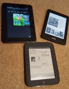
- The rise of ebooks has put enormous flexibility of choice into the hands of readers. Some people will be happy to accept whatever factory defaults have come their way, but others will want, and expect, to set their device up in their own particular way. They will fiddle with fonts, margins, alignment, colour scheme, and so on. As author or publisher, you should make available as much choice as possible and not assume other people like your choices.
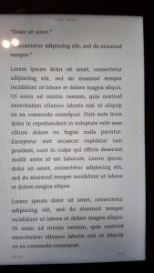
- Test your book with lots of different styles of background colour, margin size and so on. Remember that although Kindle accepts png image files, it does not (yet) respect any transparency settings you have chosen. If you want a transparent background, use gif format.
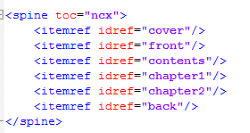
- There are two navigation methods for Kindle and other ebooks – a table of contents and the device navigation method typically accessed through a Go To menu or similar. They should both be present.
- Think about how formatting will look at the extremes of font and margin size as well as the happy medium. Readabiity studies have made harsh comments about some ways of styling a book as you move away from the centre towards the edges. There are technical solutions which can work around these problems.
Finally, no matter what you do, the result will not be delivered in exactly the same way onto all devices with all possible settings! Quite apart from user choice, there are too many differences that arise between different pieces of hardware and software, and different versions which appear over time. You may well get your writing set out with what you consider the perfect layout in one situation, but it will look quite different to somebody else. This is the reality of digital publishing, and – in my view, at least – it’s something to be engaged with rather than lamented.