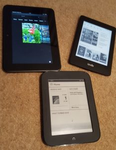
This is the first of an occasional series on the quirks of preparing ebooks. Almost everything applies equally to Kindle and general epub, but for the sake of quickness I shall normally just write “Kindle”.
The conversion of a manuscript written in some text editor through to a built ebook – a mobi or epub file – happens in several logical stages. A lot of authors aren’t really aware of this, and just use a package which does the conversion for them. Later in this series I’ll talk a bit about how Amazon’s software – KindleGen – does this, and what parts of your input end up doing what.
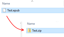
First, what is a ebook? You can see this best with a generic epub file. Find such a file on your system, then make a copy so you don’t accidentally corrupt your original. Let’s say it’s Test.epub. Rename it to Test.zip and give approval if your computer warns you about changing file extension.
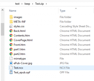
Then you can look inside the contents and see what’s there – a very specific folder structure together with a bunch of content files. This is what your epub reader device or app turns into something that looks like a book. This list not only lists the files, but (presupposing you’ve given sensible names to the source files) it tells you something about their purpose. The ones identified as HTML Documents are basically the text of the book, including the contents listing and any front and back matter the author chooses to put in. The document styles are there. There’s a cover image. The ncx file describes how the Kindle or epub reader will navigate through the book (of which more another time). The opf file is the fundamental piece of the jigsaw that defines the internal layout. The images folder contains, well, images used. The other files are necessary components to enable the whole lot to make sense to the reading app or device.
A Kindle mobi file is much the same except that there is usually some encryption and obfuscation to dissuade casual hacking. But actually, almost exactly the same set of files is assembled into a mobi file. What KindleGen does is rearrange your source files – whether you use Word, plain text, or some other format – into this particular arrangement. By the same token, if you are careful to get everything in exactly the right place, you can create your epub file with nothing more than a plain text editor and something that will make a zip archive out of the files.
So now we know that a Kindle “book” is actually a very long thin web site, divided up into convenient “pages” by the device or by an app. Kindle books never scroll like a regular web site, though a small number of epub apps do. They show the content in pages which replace each other, rather than an endless vertical scroll. There’s a good reason for that – readability studies have shown that presentation by means of pages is more easily read and comprehended than scrolling. The layout chosen by most word processors – a continuous scroll with some kind of visual cue about page divisions – is good for editing, since you can see the bottom of one page and the top of the next at the same time, but it’s not so good for readability. The scrolling choice made by some epub apps is due to developer laziness rather than any logical reason – and even here, some apps allow the reader to choose how they move through the book
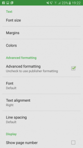
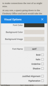
So the underlying structure is entirely different from the fixed layout called for by a printed book or its computer equivalent such as a pdf or Word document, even if the superficial appearance is similar. On a computer, you can resize the window containing your pdf as much as you like, and the words will stay in the same place on each line of each page. But with Kindle or epub, you can swap between portrait and landscape view, or alter font and margin size, or change line spacing, and in each case the words on the lines will reflow to fit. In the landscape aspect of some Kindles you can choose to view in two columns side by side. In most epub readers you can choose to override whatever text alignment the author or publisher has chosen, and read it however you like. After each such change the device or app recalculates how to lay out the text.
Now many of us choose to use some sort of word processor to write our story, in which none of this is very visible. You can certainly alter the page settings and experiment, but most people just set it to whatever their typical national page size is – A4, or Letter, for example – and leave it at that. That gives the illusion that the process of production is fundamentally the same as that of a printed book – but in fact it is not. If an author’s main intention is to write a paperback book, and they perceive the Kindle version is just a handy spinoff, then focusing on page layout seems to make sense. But most indie authors sell a lot more ebooks than printed ones, so it makes more sense to understand the particular needs of the electronic medium.
You actually don’t need any extravagant software to create an ebook. A plain text editor, together with some knowledge of simple HTML tags, is all you need along with some other free tools. But for those of us who don’t have that knowledge, a word processor plus some sort of format converter is handy. But – as we shall see later – there are pitfalls with such software, and the end product is not necessarily as you would hope.
One of the really exciting features of an ebook is that it bridges two worlds which in the past have been separate – the world of traditional printing, and the world of visual and web design. This fusion opens up huge opportunities for the reader, but has also led to misunderstandings and difficulties. Some of the opportunities are obvious, like the ability to search, synchronise across multiple devices, swap between text and audio versions, and so on.
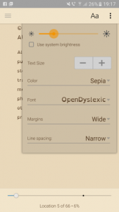
But there is much more. If I don’t like the original font, or I have dyslexia and prefer a specialised font, I can change it. If I need to expand the font size so I can read the text, I can do this. If I like a coloured page instead of black and white – and I have a device with a colour screen – I need only change a setting.
In all of this, the reader is not constrained by the author’s, or publisher’s choices. A great deal of display choice is where it should be – in the hands of the reader, not the writer. It seems to me that this fact has not been fully grasped by many authors, or small publishers, who sometimes treat an ebook as though it was no different from a printed book. They then expect to define every aspect of the display. But people who read ebooks have a considerable amount of choice over how they read – it’s a new world, and needs new thinking.
That’s it for today. Next time, I will be looking at some of the additional information that ties the separate content files together.

One thought on “Kindle preparation part 1 – the background”