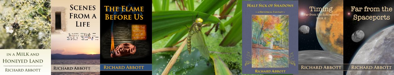
Scenes from a Life is on its very last sanity read-through before release! All being well, this means a kindle release early next week, with physical copies through Amazon Createspace shortly after, depending how long their validation and approval process takes. Watch out later this week for the cover design to appear, a splendid composite picture which would not have been anywhere near so good without the extensive help of Ian Grainger.
So I thought I would take a short break from the slightly mind-numbing process of proof-reading to talk about the tools I have used to put this all together.
First and foremost there is Amazon’s KindleGen. Being of a technical disposition I use this “raw”, with all the actual content written in HTML, and a bunch of configuration files to tie them all together and define the structure. This means that I have complete control over the output, can check the results every step of the way, and avoid the formatting slips and navigation problems that I have met so often in both self-published and small-press books.
Next, epub format, for those many people who have other kinds of ereaders. This uses exactly the same HTML source files as kindle, but with a slightly different set of configuration files. In fact epub is a much stricter and more pedantic format than kindle, so it’s easier to work always to the stricter standard too keep both happy. Also, the diversity of ereader devices and applications, and the variations on how closely the manufacturers and software writers have stuck to the spec, means that to get wide coverage you have to be quite cautious and keep well within the bounds of what is possible. Once the source and configuration files are complete, epub is simply a zip (compressed) archive needing no special tools. Long-term readers of this blog will no doubt remember the struggles I had with this earlier in the year.
Finally, the physical copies. It has been an eye-opener going back to a world of absolute distances and dimensions for the layout. So much of my recent writing and professional life has worked in situations where text can just be reflowed at will to adjust to a different size screen or window. So, working with the constraints of a fixed piece of paper has been, to say the least, interesting.
Following the advice of my Finnish friend Petteri Hannila I tried out an online tool called ShareLatex. This takes source files in plain text, and joins them together with directives that define the physical appearance – paper size and margins, font size and type, and the whole host of conventions that go into book design. It was slow and frustrating at first, but again a technical background helps a great deal, and before too long I had got to grips with the parts of the latex language I needed for both the interior and the cover. The huge advantage of ShareLatex is that the output can go directly into Amazon’s Createspace software in “camera-ready” form. The downside – apart from its general unsympathetic interface – is that the error and warning messages when you make a mistake are exceedingly obscure. And once again, unlike just using Word and exporting to pdf, you have a lot of fine-grained control.
Which brings me to Createspace itself. This is, I think,a wonderful tool for those who are going to self-publish. Unlike ShareLatex, the errors and warnings are clearly explained and presented, and so far the process has been extraordinarily simple. I cannot yet say I have finished this – that will not happen until final proof-reading has happened, followed by the definitive page count and some last-minute accommodation to that. But so far, so good.
OK, that’s all for today… back to chapter 5… watch out for the cover in a few days…